Hi there and welcome to the PaperArtsy/StencilGirl Blog hop. It has been such fun working with all the designers from both companies to bring you this bit of festive fun.
As you hop along with us don't forget to leave comments to be in with a chance of winning a fantastic prize.
GIVEAWAY
One lucky winner will receive a $75 Gift Certificate to StencilGirl Products
AND a £50 Gift Certificate for PaperArtsy!!
Visit the fabulous designers from both teams and comment for your chance to win!
The more blogs you comment on, the more chances you have to WIN!
(One comment per blog please.)
You have until Friday, December 30th at 11:59PM Central Time to leave your comments.
I began by gathering my supplies, first I chose canvasses as my substrates. One large canvas board, a smaller canvas board, 2 tiny frame canvasses and 2 small tags.
I also pulled out some Christmas stamps from my sets EDY04, EDY15 and EDY16.
and here are my selection of StencilGirl stencils.
-->
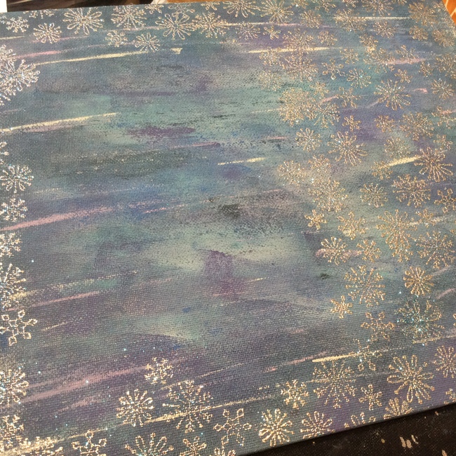
I began by sponging and scraping PaperArtsy Fresco paints over my large canvas board. I used Midnight, Southern Skies, Purple Rain, Blueberry, Turquoise, Lilac and Hint of Mint. It seems a lot of colours but they all blend and coordinate beautifully and only a tiny amount of each is needed.
I placed the face stencil on the medium canvas board, making a few pencil marks I could then remove the stencil and block out the rough shape with Blush and Rose. Once these were dry I replaced the stencil and added shading with more Rose, a little Irish Cream and some Chocolate Pudding .
Next I worked on the background, leaving a gap for the hair. I sponged on some Purple Rain and Mermaid.
For the hair I again marked out in pencil where it needed to be, then I added Chocolate Pudding and Toffee.
Once these were dry I replaced the stencil and then added Caramel, Copper and Haystack.
I kept layering the hair through the stencil till I was happy, then finished it with a few lines with a black pen. Next I added the smallest of the tall birds, he is stencilled first in Chocolate Pudding, then Caramel. A little Chalk and black pen complete the brown areas. His little red chest is done with London Bus, Mahogany and Copper.
Now for a little texture. I added white out areas on top of the girl and the bird using chalk.
Then painted the main parts of the hats with London Bus and Copper, with a little Mahogany to shade.
I added some Expandit, this is wonderful stuff. You dab it on, heat it up and it expands and fluffs up. It makes great texture. Once this had expanded I went over it with a little Chalk paint.
To finish this layer I added more embossed snowflakes around the edges and also stamped my bows and baubles from EDY04, the bows are painted with London Bus and Copper.
This is how this layer looks now.
Next the mini canvasses, first painted with Purple Rain and Mermaid. Then stencilled with the spheres stencil and using Bora Bora mixed with Mermaid. To keep consistency I also edged them with the same WOW embossing powder from earlier.
Along the bottom edge of each I stamped my trees from EDY16, these were coloured with South Pacific, Caramel and Chalk.
Now for final embellishments. I painted some smoothy card with Hey Pesto and stamped my holly leaves from EDY04, they were then embossed with WOW Evergreen.
The 2 small tags were painted with Midnight, then Crackle Glaze and finally Chalk. over this I stencilled some words from mixed media mail using London Bus and Copper. The 'Santa' word is handwritten.
Finally a piece of card painted with Hint of Mint and mounted onto black card was stamped with one of the phrases from EDY15
All that was left to do was glue it all together. I use Golden matte gel as it is very strong, especially for glueing canvasses together.
Here are all the guest designers that are taking part, visit each one and leave a comment.
Blog Hop Order:
Visit these four blogs on Friday.
Finally visit these four blogs on Saturday.
I hope you all have a wonderful holiday.
Darcy x


.gif)